MSRTC
Identity Redesign and Brand Communication of MSRTC
Project
Individual
Timeline
4 week
Tools
About the brand
MSRTC or simply ST, is the state-run bus service of Maharashtra, India, which serves routes to rural villages and cities within Maharashtra as well as to its adjoining states. Established in 1948, it has grown into one of the largest state owned transport fleets in India.
Context
These buses has been in service since decades, connecting 87% of the state’s villages and nearly 6 million daily commuters across a massive, diverse geography.
However, aging infrastructure and declining service standards have strained the brand’s legacy, creating a trust gap that increasingly pushes commuters toward private alternatives.
What can we do to regain the trust of the people while honoring the legacy of MSRTC?
Primary Research
Challenges
Adapting communication styles to engage with a wide spectrum of users. from farmers, elders, non literates-literates, students, tourists to daily commuters.
Objectives
To identify the functional and emotional friction points within the current MSRTC ecosystem through direct user immersion and a visual audit of existing touchpoints.


Visual Library
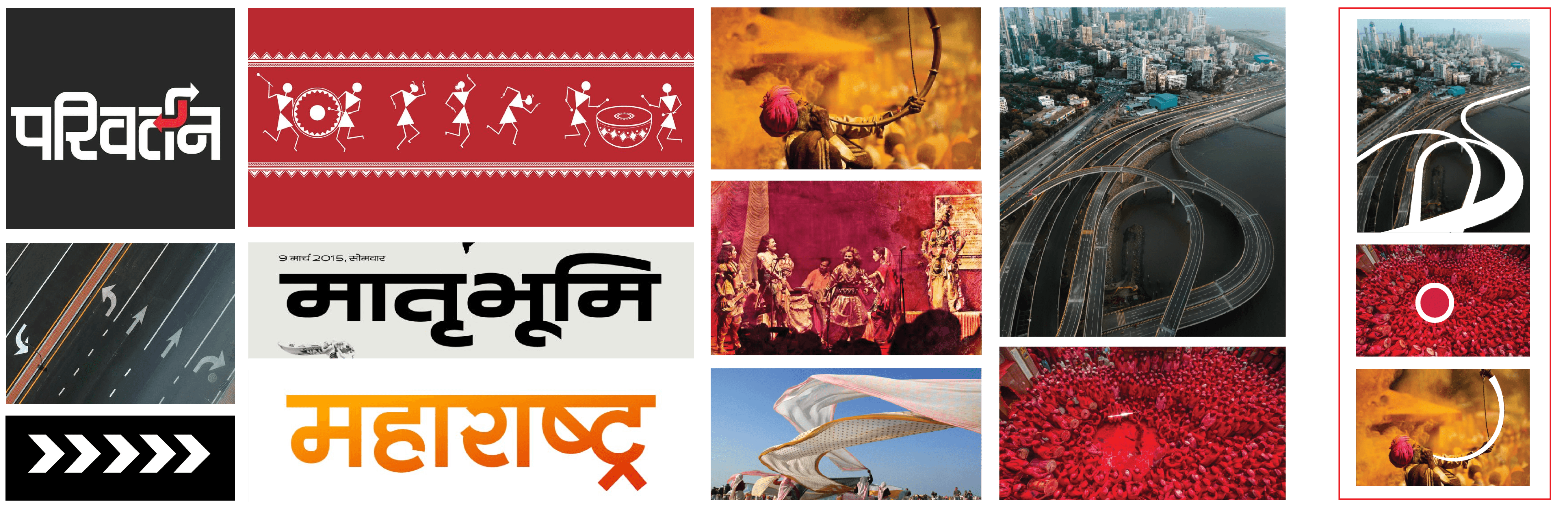
Initial Ideation

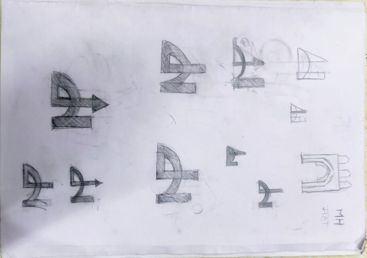

Initial Exploration
Final Form
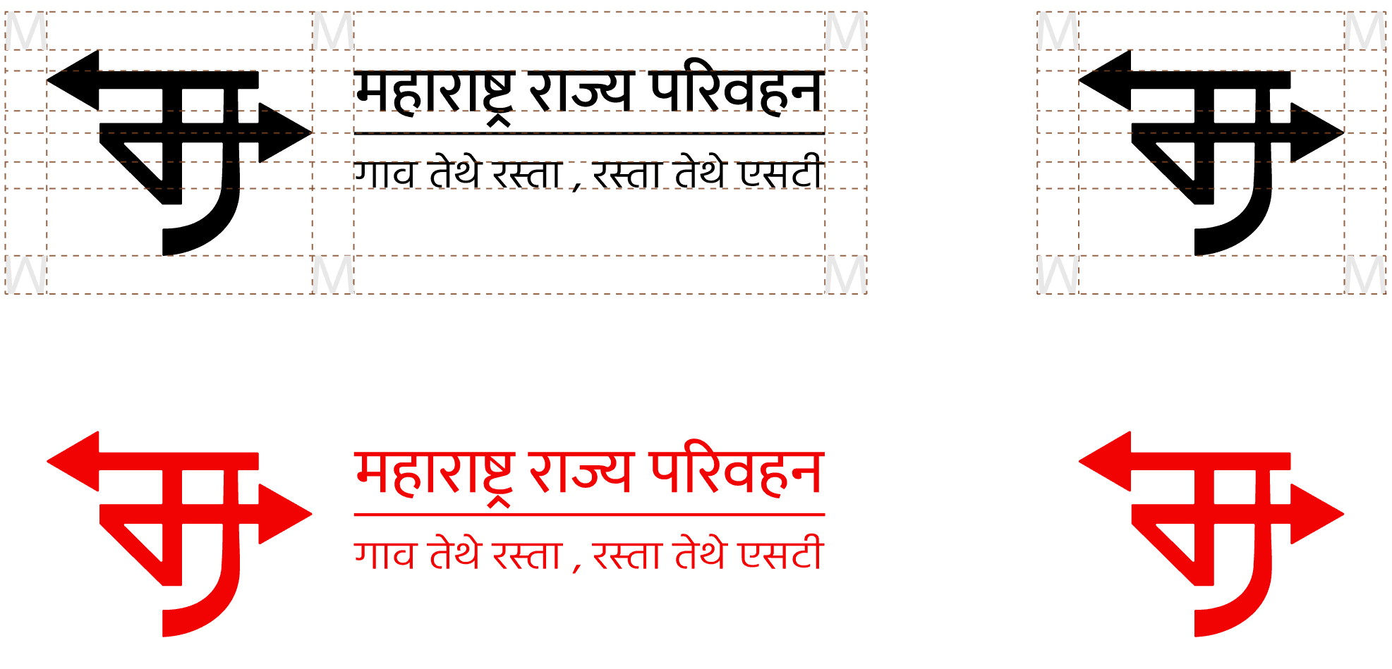
Typography

Brand Color
#ED2024
MSRTC Red
RGB : R :237, G: 32, B: 36
CMYK: C: O%, M: 99%, Y: 100%, K: 0%
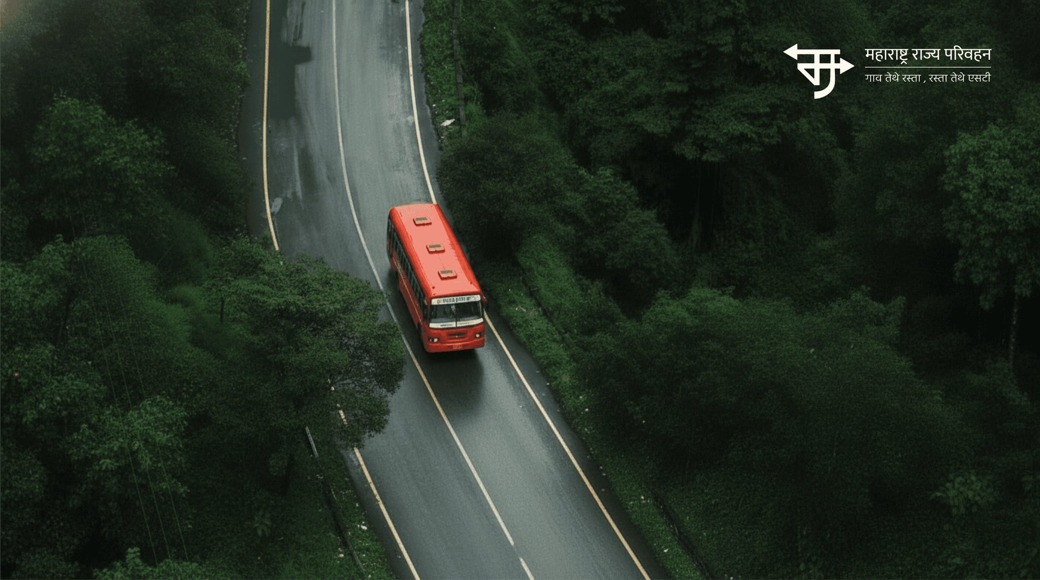
Final Identity

Brand Collaterals

Brand Touchpoints

Credits
| MSRTC, Nanded
Project Guide
| Dr. Anil Sinha | Prof. Saurabh Vyas
Next Project
